Marc Chatalas contacted me a few years back because he had seen some of my web design work around Seattle and wanted to meet me. We had a drink over at Alki Beach and we talked websites and design. As it turned out, he didn’t really have any pressing design needs at the time, he just wanted to see what I could offer for future reference. At the time, I was still working at an agency while doing freelance design for restaurants on the side.

The Collaboration
Fast forward to the future (early 2011) and Marc contacted me again to discuss a new website and ultimately a brand refresh to coincide with the opening of a new Cactus location in South Lake Union. This sounded like a perfect fit for the business I had just started a year earlier. My goal has always been: to offer soup-to-nuts design for restaurants (I just trademarked that BTW). But sadly, I was buried in work. Too much work in fact, so I told him no. I recommended some other, bigger firms in town, but in doing so also told him that he would likely pay more and get less with a bigger firm. My way of keeping one toe in the door I guess.
A week later he emailed back and asked me to work on his project again. Due to my sinister workload, I should have said no a second time, but the project sounded really challenging and fun, so I started looking for a partner to help out on the print side. My plan was to get someone to collaborate with me directly on the brand refresh, then set him or her loose on the print collateral while I worked on the new website and gathered photography. Nikki Cole Creative agreed to join the effort, and we pitched the idea to Marc and his brother/business partner Bret. In early summer of 2011 we started work on the new Cactus Brand.
The Old Brand
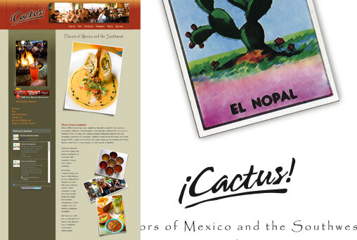
The old Cactus website and logo.
Cactus Restaurants has been around since 1990. They started out small, cooking tapas at their first location in Madison Park. The logo itself had been updated a few times, but the overall look and feel of the brand was made up of a lot of different parts over the years and it was becoming unfocused and disjointed. Another problem was how they displayed the name ¡Cactus! by using the traditional Spanish punctuation. With the advent of all things iPod and iPad people began to mistake the name for something related to the tech industry: i-Cactus. This was eroding trust in a brand that really wanted to stay humble for the most part. It reeked of bad marketing decisions by no fault of their own (blame Steve Jobs).
Something else I noticed in talking with them is the notion of Southwest cuisine itself. What was once a hugely popular cuisine in the 80s had been slowly pushed to the back burner in favor of more traditional Mexican or Taco Truck style restaurants. But Southwestern food is actually great, so why do people downplay it? I wanted to explore this. I used to work in the agency world and often brand strategists would say things like: “Company X needs to own the color red.” I always found that to be kind of a ridiculous statement. How do you “own” a color? What the brand people really mean is: “Pick a color and use it a lot”. But, in thinking about this more, I really started saying to myself that Cactus should indeed “own” Southwestern cuisine. It really is a good differentiator for them in a market that is full of so many Mexican restaurants. Cactus does great Mexican, but the Southwestern stuff is really where they can make a statement.
The Brief
The creative brief for the logo was pretty simple. We wanted something a bit more modern and also a bit more sophisticated. This was driven by the new South Lake Union location which was going to be different stylistically from the previous Cactus restaurants. But, we also wanted it to work well at the older locations too, so it couldn’t be too slick. It needed some texture. And really, what we heard the most from Marc and Bret about Cactus is that they want the restaurants themselves to make you feel like you are on a vacation. When you dine at Cactus you should feel like you are taking a much needed break, enjoying a cocktail on the beach, relaxing. The brand needed to communicate that somehow.
The New Logo Direction
We explored a lot of different directions over the course of a month or so. We had cowboys, saguaro cactus arms, cactus flowers, Navajo cave paintings, type solutions pulled from old Mexican signage, and a whole lot more. We presented six solid options with a lot of variation. After the first meeting we had narrowed it to 5. (Not what we had in mind!) But, we liked them all too, so we went about refining the various options and incorporating feedback from the guys at Cactus.
Early design roughs.
Mimbres
In the end we all decided to go with an option we were calling Mimbres. The idea for the mark was based around a style of Native American pottery found in what is now southern New Mexico. It offered us an opportunity to actually create four distinct marks, one for each of the Cactus locations. (This increased our workload fourfold, but we felt it was worth it.) Nikki did the illustrations herself, borrowing a bit from the Mimbres art, but in the end she really made them her own and incorporated abstract representations of cactus plants and flowers in each one. What’s great about the logo marks is that they are born from a marriage of Soutwestern folk art and cactus plants—but without being obviously cactus plants. The Saguaro cactus arm was really something we wanted to avoid (think Taco Time). So for instance, we used a top-down view of a barrel cactus for South Lake Union but the shape also works without that meaning as a stand-alone motif. Even better still, it could also be a lime wedge on the rim of a cold margarita. We ended up with a lot of room for interpretation which really made the whole identity system shine.
Website
While Nikki began producing new menus and collateral, I switched gears and began creating the new Cactus website. We wanted something bright and sexy, but function was equally important. With four different locations this can get tricky, so there had to be clear paths to the stuff people wanted most: hours, directions and menus. All the while keeping the user oriented to the individual locations themselves. The rest was easy. We had so much material to work with following the branding phase of the project, that the look and feel fell into place rather quickly. A good argument for finding a print designer who is also your web designer!
The Next Phase
This project was really fun. And fun because Marc and Bret Chatalas are great people to work with. They provided great feedback and brought a lot of good thinking to the process. And, they knew exactly when to be involved and also when to jump out of the way and let us work. I’m looking forward to a long working relationship with the brothers at Cactus. (We even designed a fifth logo mark just in case they get curious about new real estate.)
In the end, I’m glad Marc decided not to take my advice and find a bigger firm to work with. I haven’t had a day off since last summer, but it was well worth the effort.